ITS websites & service desk application UI
Web design and development for Information Technology Services at the University of Melbourne
The brief
The goals for this project included:
- integrating the site into a new template framework
- along with reviewing the IA and voice and tone, align the visual communication and interactions to ensure ITS messaging was more user-focused and friendly
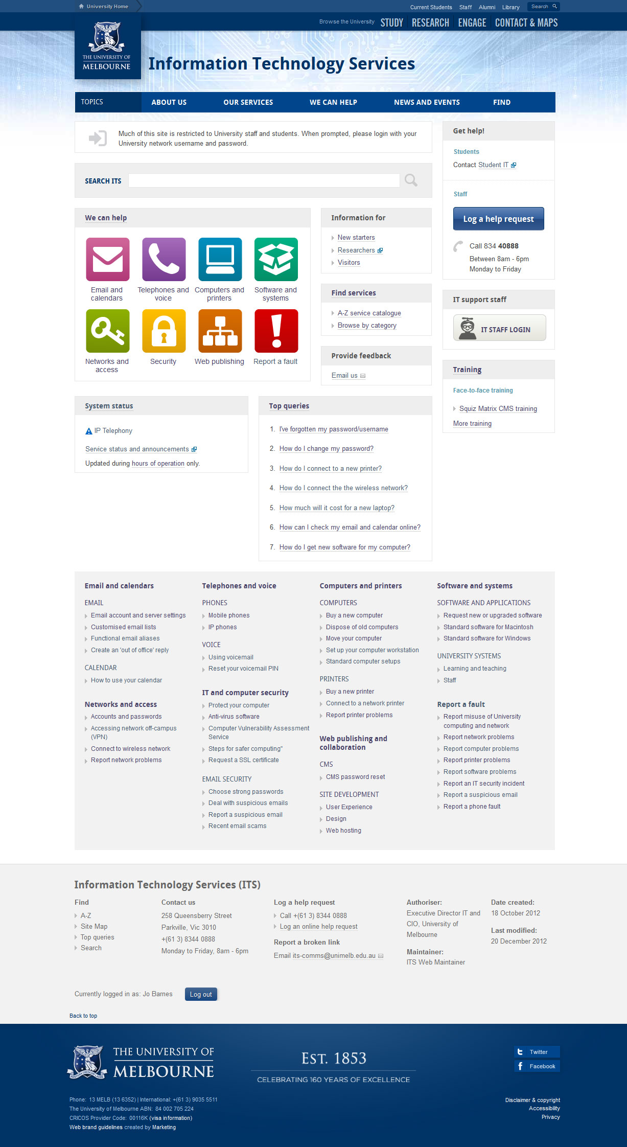
- using a dashboard style for the front page
- improve consistency of messaging across ITS applications – including developing a common visual language to be used across the ITS website and the service desk applications
Tools
The tools I used in this project included:
- Fireworks (wireframes, mock-ups and functional specifications)
- Bootstrap (HTML prototype / template framework)
- Squiz Matrix CMS
- HTML, CSS, jQuery
- Photoshop (image editing)
- Excel
- Basecamp (team / stakeholder comms)
- GoPlan
First steps
Team sketching sessions
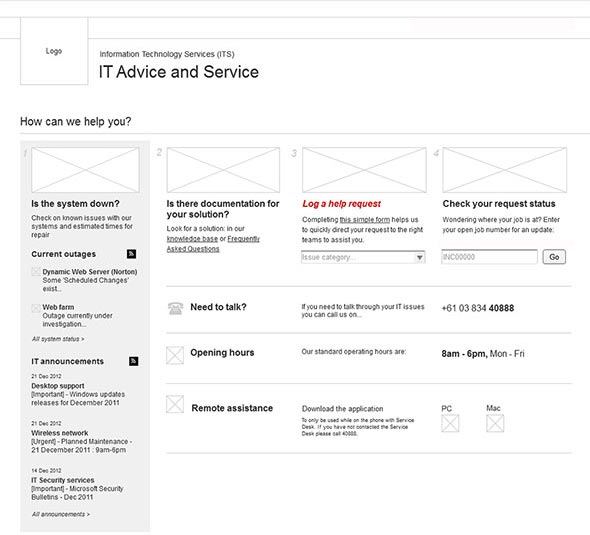
Each of our team was asked to come up with a critique of the existing page and provide some quick concepts about how they would improve the front page, to discuss as a group. This was my version. My goal with this design was to visually clarify the process, make self-service options more prominent and make all of the important information accessible up front.
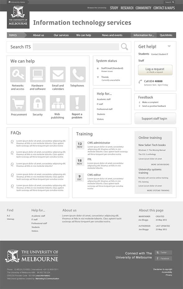
Wireframes
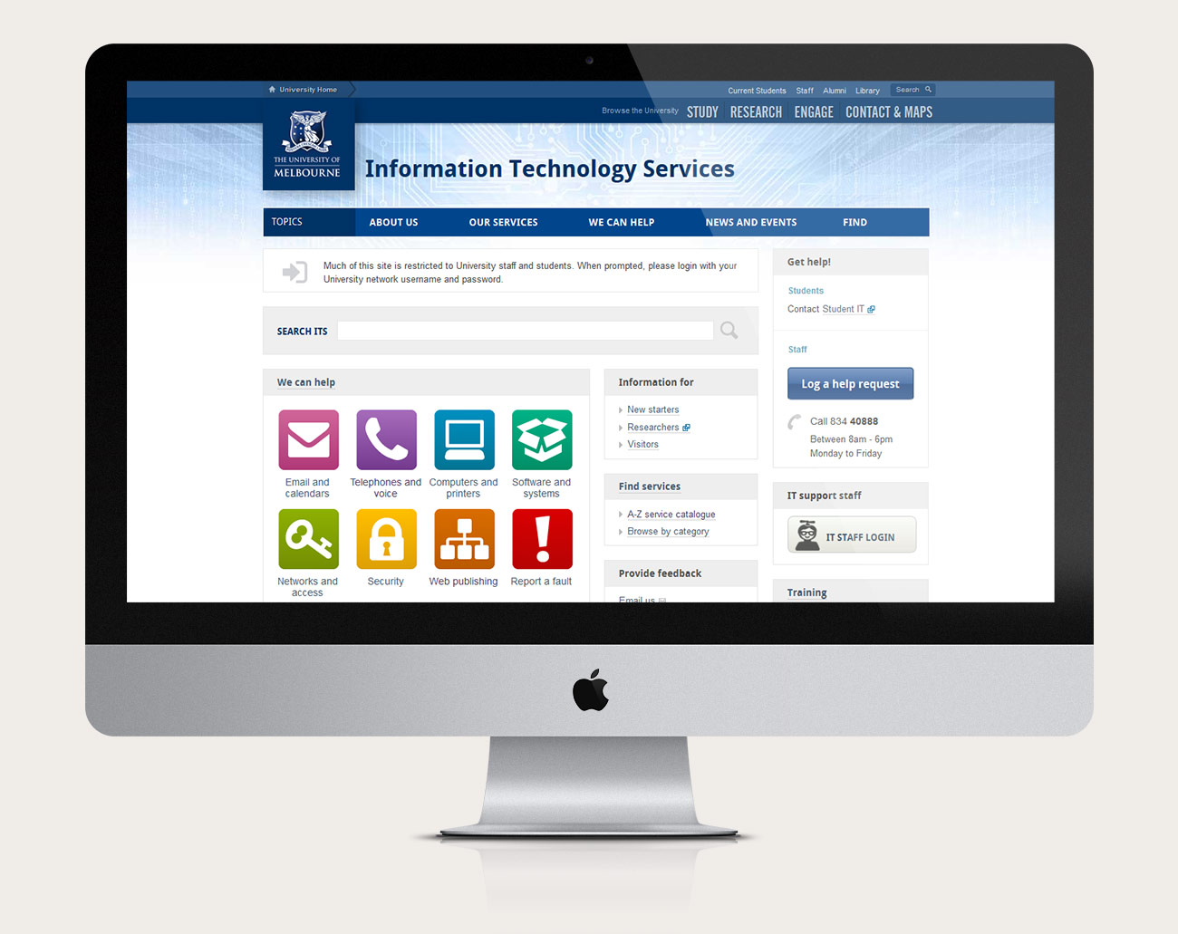
Late in 2012, I designed and developed an interface for the new ITS website. This involved putting it into the new CMS templates and updating the design. These were some of the early explorations.
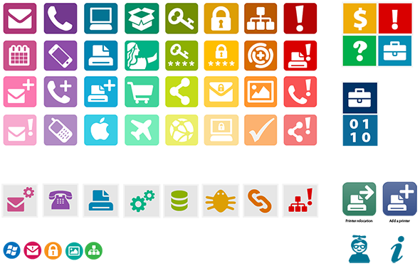
Icons & visual language
The brief for this project was to update our website and to create a visual language that could be used across IT applications, including Remedy, the ITS help tool.
The brief for the website redesign included integrating a design with a new University template, and creating a more friendly, accessible and helpful ambience. Using a dashboard influenced style for the front page, facilitated an at-a-glance summary of a complex array of information (for a diverse range of users) in a brief space (which then linked into further information).
The header background was designed to add a light, serene (and progressive) ambience, and the colourful icons to add friendliness and warmth. The goal was to try to promote a soothing and orderly feeling for users - who were contacting ITS often when they were a bit stressed, trying to solve their IT problems quickly in order to achieve their other, primary goals.
Icons
Mainly due to time constraints, these icons were mostly chosen from pre-existing icon systems with a common look and feel, although some were designed from scratch (eg. the propellor-head geek icon) and some were customised versions of existing icons.

HTML prototypes & CMS development
Late in 2012, I designed and developed a new ITS website. This involved putting it into the new CMS templates and customising the interface.
Finding tools
A variety of findability tools were integrated into the site to cater to users different finding preferences / different contexts. All of these were custom-built to be automatically maintained using asset-builders within Squiz Matrix CMS.
Mega menu
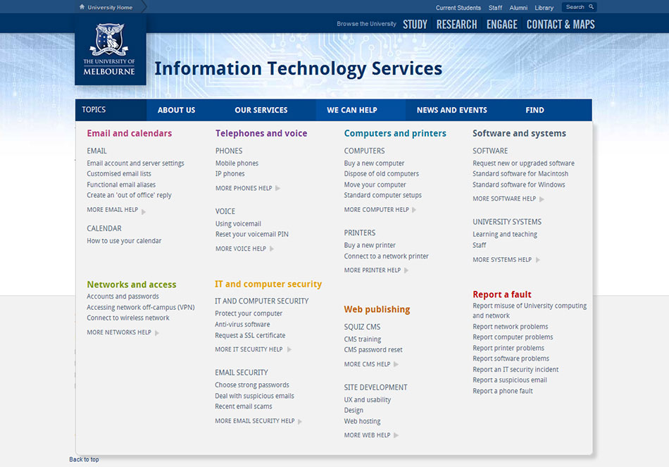
A fully accessible mega menu allowed for quick access to content multiple-levels deep from any page within the site, as well as a quick at-a-glance overview of the sitemap for each section.
A-Z index
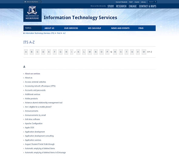
An A-Z provided an alternative way of searching for content, using quick alphabetical links. Alternate labels could be cross-referenced using links to aliased pages.
Search
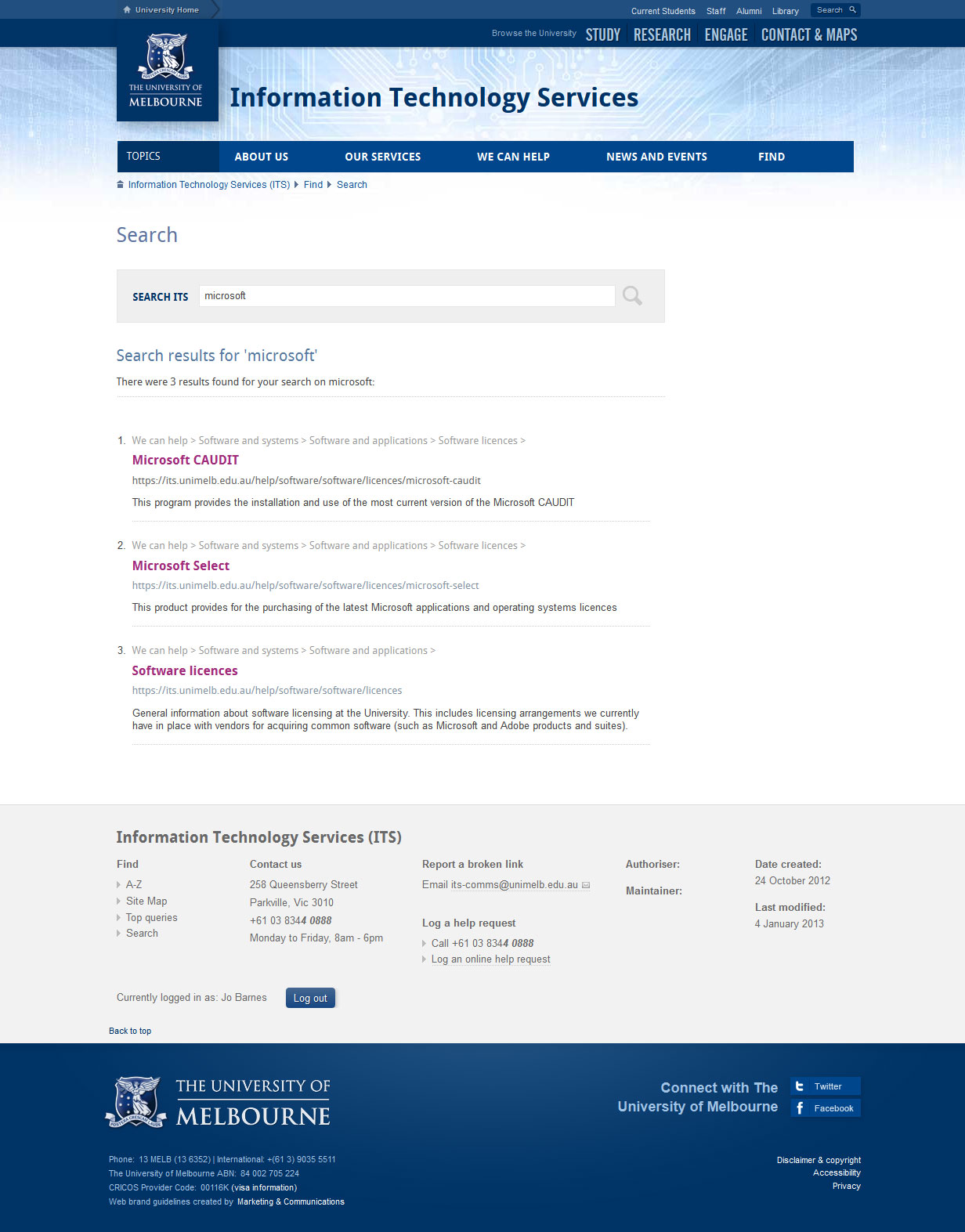
Adding a custom search to the site allowed a flexible way to search within the ITS domain. Given that the site content was moving from public into a protected intranet space it was extra important to have this functionality available, as it would now be hidden from search engines, and the University's public site search.
In addition, there was a site map and an FAQ page.
Version 2: Mobile first redesign & intranet integration
Version 2 was fully responsive website, which was also a model demonstrating how other staff intranets could be quickly integrated into the new Staff Hub (as an interim measure whilst a full solution was being built).

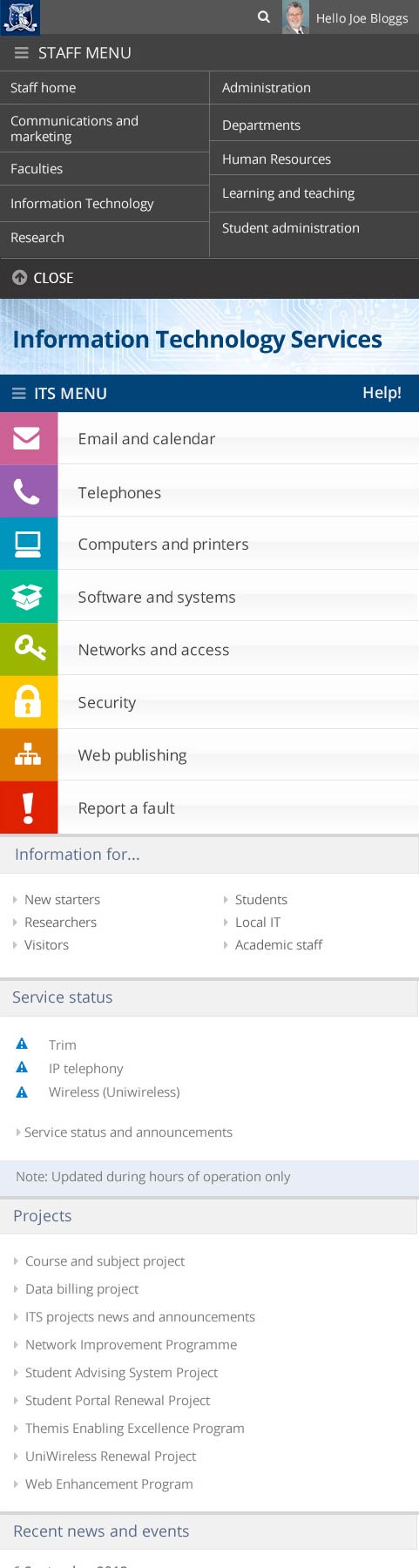
Personalisation
I built a proof of concept in HTML, then in Squiz Matrix CMS, demonstrating how the integration of personalised menus could work. Once logged in, these would show options depending on what permissions you had – eg regular users would see options customised to them (eg. logout / change password) editors would see an additional editors menu, and administrators would see all menus, which provided shortcuts to key tasks and support options.
I wanted to make support information easier to find so that sites could be maintained more consistently and reliably – making for a more meaningful experience for both site maintainers and users.
Intranet integration
As part of the University's new Web Strategy, there had been discussions about how to integrate informaton for staff into a central hub. This was an early concept about how this might be done as a first stage, with minimal overhead for redesigning the existing sites - by adding a global header to the existing sites.
Mobile first templates
Whilst the first version had responsive elements built in and could be viewed on mobiles and tablets, during 2013 I started to look at building a version that was 'mobile-first', fully-responsive, and better optimised for mobiles and tablets. It also made more use of the space on wide screens.
Example: Responsive help module
The 'we can help' unit on the front page was adapted to fit to four different views to suit their context - eg. mobile had a much simpler list view and large desktops utilised more space to expose more 'information scent' / links to popular content for each category.
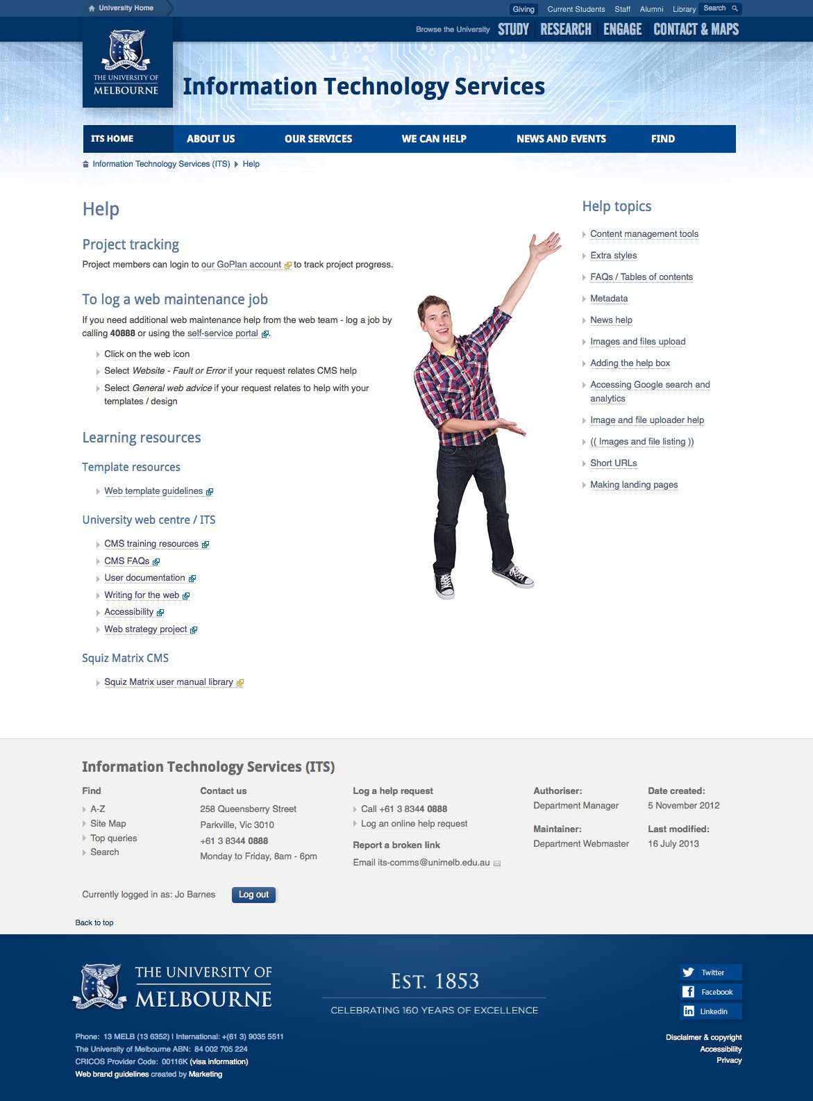
Support / handover site
This was the first support / handover site that I created entirely online (previously provided in Word/PDF documents) to assist site editors and maintainers with site administration tasks.
Sharable and discoverable repository
The purpose of these sub-sites was to make the content more sharable and linkable in a modular way (eg to be able to share instructions for specific tasks) and to include the site maintenance tools (eg. news builders, content management dashboards) together in one spot.
Embedded, findable and discoverable
These were linked under a /support folder in the main site, but had permissions assigned to it so that only logged in maintainers and administrators could view it.
Repeatable
Certain sections could be maintained within a central repository and nested within each site, so that we could maintain an authoritative hub of information for web maintainers.
Extensible
Other sections were relevant only to that sub-site and could be updated and extended by site maintainers according to their particular needs after handover.
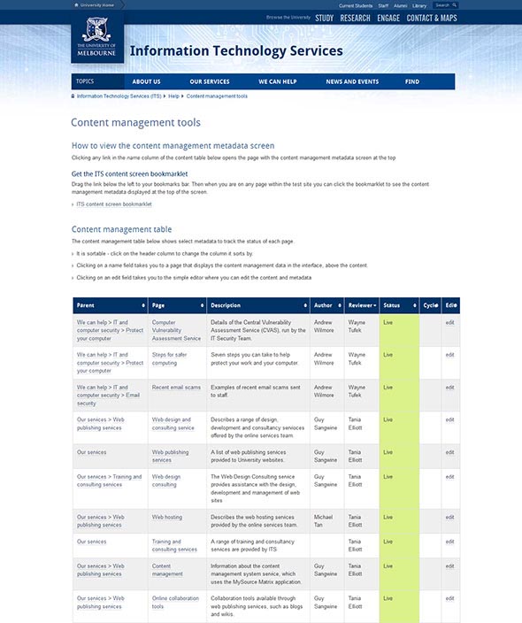
Content Management Tools
Tracking table
Content management tools were built into the support site that enabled users to sort tasks by status, owner, reviewer, title, parent, etc...
Tracking bookmarklet
Maintainers could preview a range of content meta information could be viewed at the top of any site page in the site by using a URL prefix (or a bookmarklet). Including page goals, meta descriptions, search terms, and other meta information.

Content builders
I created some asset-builders to allow site maintainers to create new content easily via a form / WYSIWYG interface, such as adding new news items.