Staff Hub
Intranet design and development for the University of Melbourne


In September 2014, The University of Melbourne launched the first iteration of a Staff Hub and University wide intranet. I was involved in many aspects – including concept pitching (developing a series of concept mock-ups illustrating possibilities), HTML wireframes and prototypes, and template development in Squiz Matrix CMS on a Bootstrap framework.
Project Details
- Client University of Melbourne
- Date September 2014
- Skills Web design, branding, template design, responsive design
Context
Background
Need, problems
In 2014 University of Melbourne launched it’s first iteration of a University-wide intranet and the first of a series of themed hubs. The goal for this project was to consolidate a number of key University staff-only web resources under a unified information architecture and to present staff-only information and communications in a secure, consistent and user-focused way.
My role
Working with a diverse and changing team within the Web Enhancement Program, and with stakeholders across the University, I was involved in many aspects of this inaugural hub project – including concept pitching / ideation, HTML wireframes and prototypes, visual design, and responsive /mobile-first template development in Squiz Matrix CMS on a Bootstrap framework. I also helped with importing and editing content.
Tools used
- Illustrator / Acrobat (wireframes and functional specifications)
- Fireworks (straw men / concepts)
- Bootstrap (HTML prototype / template framework
- Squiz Matrix CMS
- HTML, CSS, jQuery
- Photoshop (image editing)
- Excel
- Basecamp (team / stakeholder comms)
- Jira agile (team comms and project tracking)
- Git (site back-ups, basic versioning)
Concepts & ideation
Based on a loose brief, and the extensive user research conducted by my colleagues, I iterated through a series of ‘straw men’ / mock-ups that were used by project leaders for pitching concepts to senior stakeholders. The outcome was a go-ahead for the next stage.
These concepts were more high-fidelity than usual for early stages. They were not intended to be refined or final designs and were still generated quite quickly. However, many rounds of wireframes had been presented to senior stakeholders previously and had not yet proven persuasive enough to get the green light to progress further.
Adding more design, including incorporating them into existing templates (and building some visual harmony by using elements of different templates currently used by the University), helped to illustrate more clearly how these might fit within the current context and provide a framework for extension into new territory from there. It helped present a vision of how we could start to take steps to get from 'here to there' and to facilitate more discussion around what was viable.
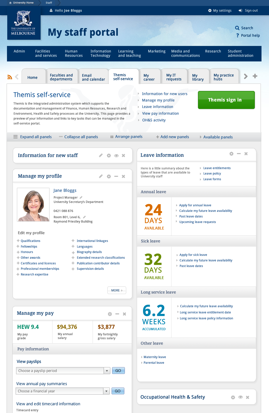
This first version shown here illustrated 18 types of pages, including views of different states such as logged in and out. Shown below are the homepage, a faceted search results listing (for logged in users) and a view showing potential for integration with Themis (the University’s HR, finance and research database).
These were able to convey a lot of information in only a few pages and fulfilled a purpose to facilitate discussions around needs and possibilities.
Not constrained by limitations of functionality of current systems or past, their intention was to establish a goal state, which allowed broader thinking about specifications.
Front page dashboard
This screen illustrated how different feeds of information across the University could be summarised / quickly accessed from a dashboard style interface - eg feeds and notices from the library, from IT and HR systems, media and event feeds, and more.
Integration with HR systems
This screen synthesised the information that many users had articulated that they wished to have easy access to from HR systems eg. easy access to summaries of leave, to be able to edit their own profiles, etc.
It also illustrated a style of panels that could be moved around and personalised.
Faceted search
The screens below illustrated some of the potential ways that a faceted search might work and including popularly requested features. In this particular example it shows a general search result (with optional filter tabs at the top) and then a clickthrough to an academic profile result.


Alternative concepts for look & feel
As the project progressed, I was able to explore more ideas around potential look and feel. Below are two examples of alternative directions using the front page as an example.
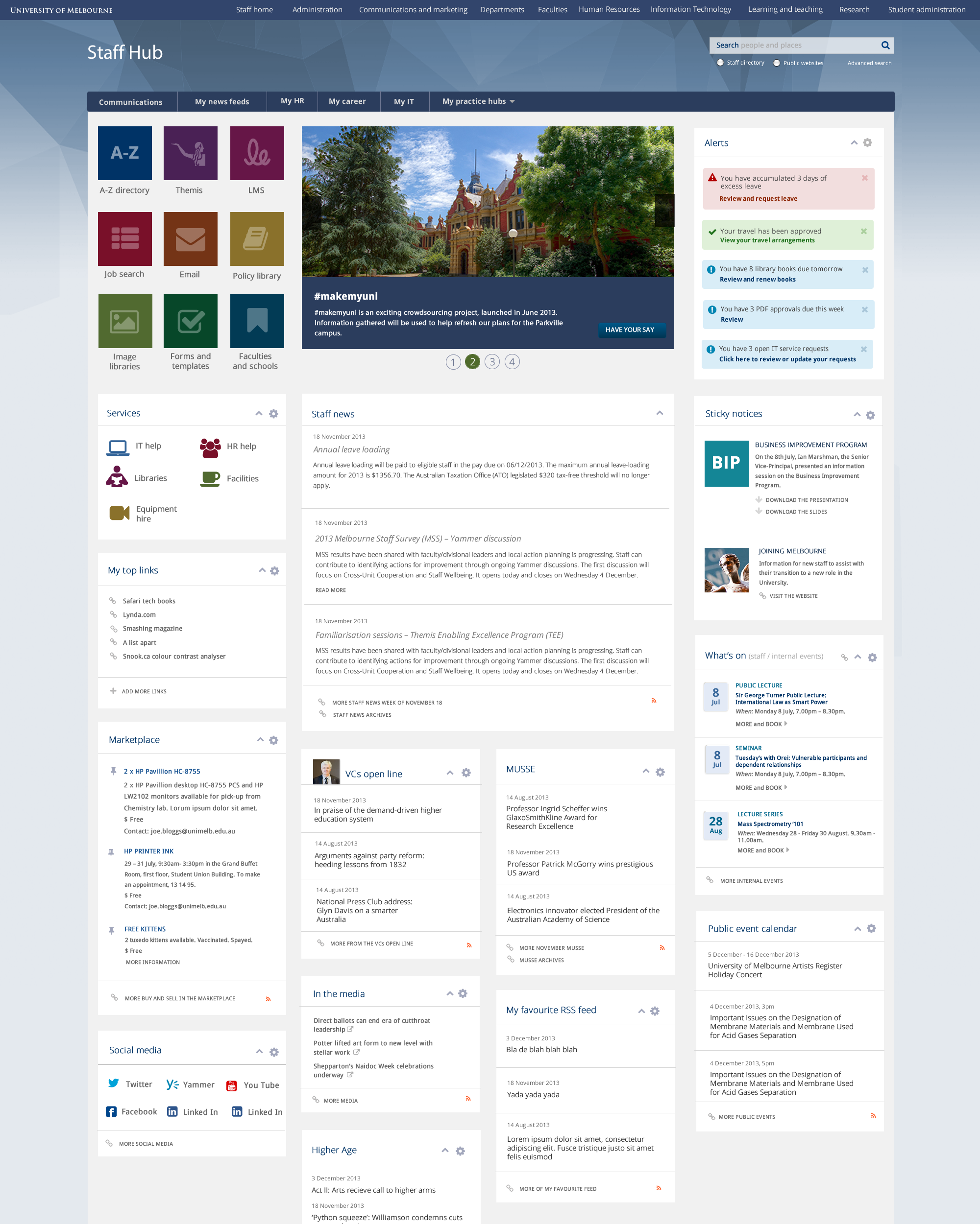

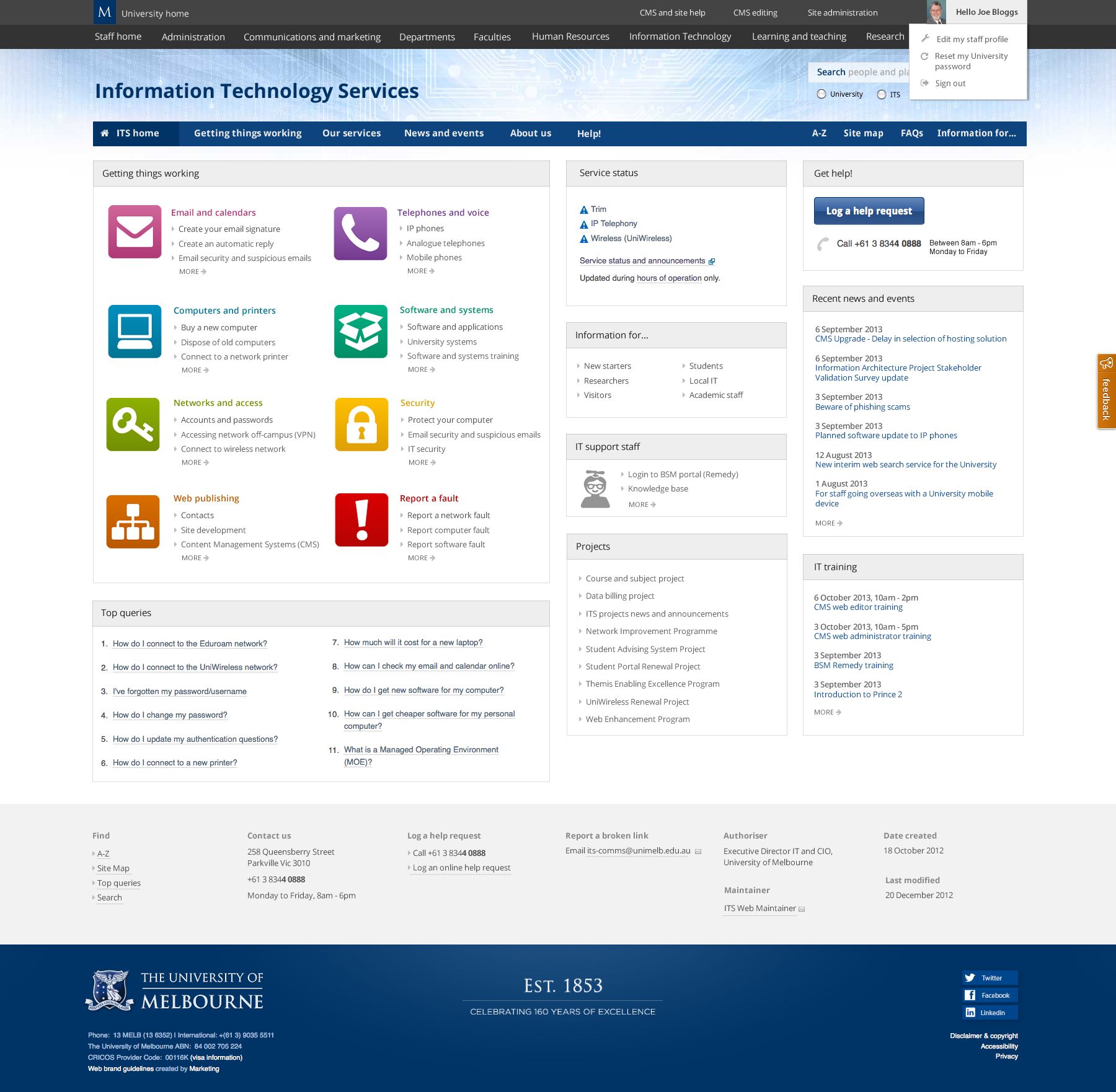
Intranets integration
One of the initial goals of the Staff Hub project was to integrate existing staff-focused sites into a common intranet navigation structure / foundation interface in a way that was as quick and low-maintenance as possible. These mock-ups and prototypes explored a possible method of doing this, using the existing ITS website as an example (whilst also prototyping a mobile-first version of the ITS website that also made better use of wide desktop screens).
As these intranets were in different systems and had very different interfaces, this version proposed to integrate them by overlaying them with a common header navigation structure using slide-down mega menus. (With extra functionality for sites built in the enterprise CMS).

CMS build
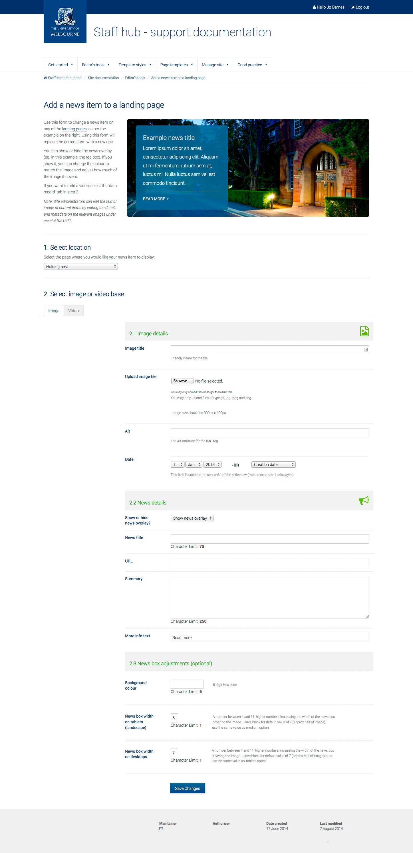
Landing pages
These pages underwent a lot of design and content iterations (even after they were developed in the CMS) – as more and more people became interested in the project and contributed new feedback to be integrated before launch. This required a continually flexible and agile approach and a commitment to quality and attention to detail in an environment of fast paced flux.
My work on these pages included:
- Foundation responsive design / layout
- Designing and developing a variety of banner areas which could integrate images, video and text
- CMS asset builders so that staff with minimal web training could maintain / update them
- Designing and developing link asset types and grouped asset lists that were also easy to populate and manage by staff with minimal web experience
- Adjusting these somewhat complex CMS structures quickly and frequently in response to senior stakeholder feedback whilst maintaining systematic code and build integrity


News and events section
My work in this page included:
- integrating a variety of public and private RSS feeds via the CMS and presenting them in a consistent manner
- integrating the events feed via API
- responsive interface design
- developing a variety of banner areas and CMS asset builders so that staff with minimal web training could maintain / update them
Section indexes
Examples of some of the different landing pages. I built a custom form interface so that editors could easily manage the images and links (eg. changing or removing the news overlay, colour and size to fit the chosen images).
These pages in particular underwent a lot of design and content iterations even after they were developed in the CMS, as more and more people became interested in the project and contributed new feedback to be integrated before launch. This required a continually flexible and agile approach and a commitment to quality and attention to detail in an environment of fast paced flux.
My work on these pages included:
- The base responsive design / layout
- Designing and developing a variety of banner areas which could integrate images, video and text
- CMS asset builders so that staff with minimal web training could maintain / update them
- Designing and developing link asset types and grouped asset lists that were also easy to populate and manage by staff with minimal web maintenance experience
- Adjusting these somewhat complex CMS structures quickly and frequently in response to stakeholder feedback whilst maintaining some systematic code / build integrity

Responsive design
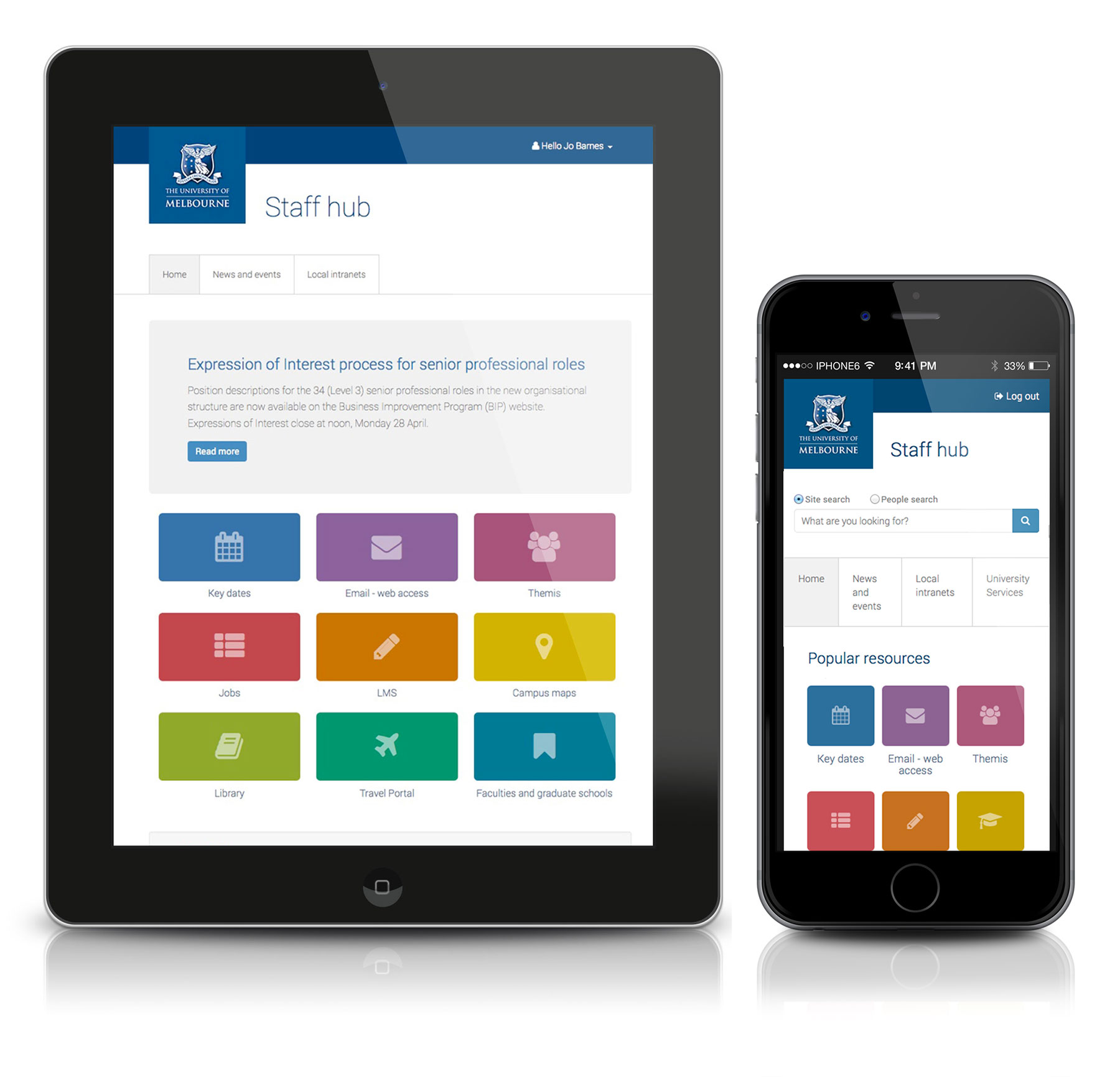
Mobile-first
The Staff Hub was approached with a mobile first / responsive approach to development.
Bootstrap framework
It was also built upon a Bootstrap foundation in Squiz Matrix CMS. The aim in using Bootstrap was to make it easier for content maintainers and additional developers to maintain and develop the site. As Bootstrap is a popular framework it was already familiar to many, is well documented and easy to learn.
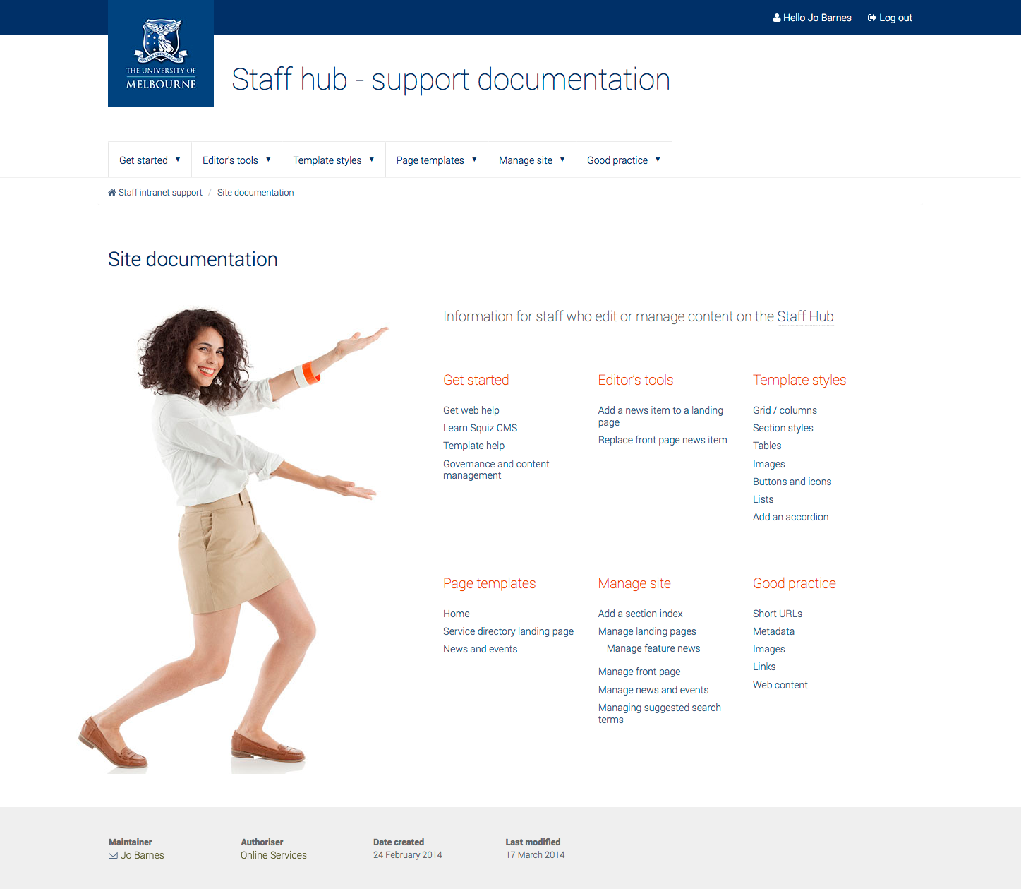
Support site
Along with custom handover training (in person), this support site was provided to site administrators and maintainers inside their site folder. It provided tools and instructions specific to maintaining their site as well as links into relevant information provided elsewhere by internal and external web communities to help them with their maintenance tasks. Each support site is based on a standard base template so I can implement it quickly for each new project.
It uses nested content areas for efficient reproduction, ease of updates and consistency of messaging, but is also easily customisable for each client or project and administrators can easily build upon it.