Cosmos design system
Design system advocate and manager for YOUniverse's design system—including UI design, UX research and testing and system documentation
The problem
YOUniverse’s web app UI evolved over an extended period of time (many parts of the product were inherited from another system), and you didn’t have to dig too deep to see the stylistic strata across the UI—there were many different eras of styles evident across the modules, reflecting where the features and UI were iteratively modernised—so the experience could be disjointed as you navigated across the suite.
The vision
Improve consistency
The idea behind creating a Design System for YOUniverse was to improve the consistency across all of YOUniverse's assets and to ensure a flowing and holistic experience across the suite, including our new mobile app.
Improve scalability
As we were working in an agile environment and focusing on delivering small parts of the app at any one time, it was important to maintain a view of the whole product and design in a way that would enable the team to efficiently scale design across the suite as we focused on the details of individual features and components.
Increase speed to deliver
It would also enable us to work faster to assemble new features upon a flexible foundation of repeatable elements and patterns—this would allow our team’s design and development energy to be more efficiently focused on solving the more unique, creative and challenging problems in future (instead of solving the same or similar problems repeatedly in different ways, which is easy to do if you don't have a systems in place to track where modules are used and provide a bird's eye view).
Role & team context
My role
My role served as a design system advocate, which included:
- UI/UX design - researching, designing, testing and documenting designs and interactions across our product suite
- Identifying and extracting patterns and organising them into a UI kit / design library - for efficient re-use
- Writing and editing design system documentation in Confluence, and
- Supporting the development team to create a front-end code library / living style guide in Storybook
The team
I worked with a team that included:
- Product owner—to prioritise components to work on next
- Marketing and sales—design guidelines and marketing strategy
- Developers—QA testing a front-end pattern library
Read more about my process for the YOUniverse mobile app design
Process
As I focused on designing and testing specific details of the product just ahead of the product team’s agile sprints, I always maintained an eye on what repeatable patterns I was working with and how these details fit into the wider app schema. I endeavoured to make my designs as scalable and re-purposable as possible, whilst also always being fit for their specific purpose.
(The work / process outlined below was not necessarily completed in a linear manner as it evolved over an extended duration, as time permitted between other projects.)
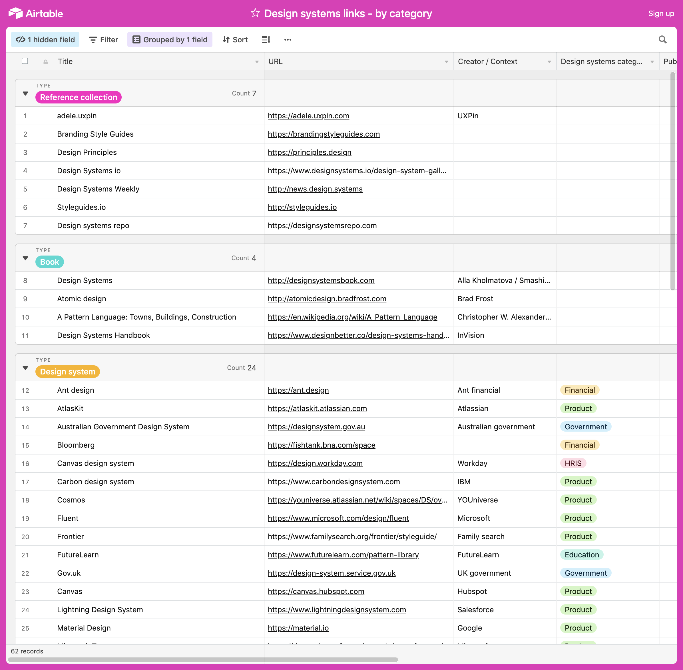
Comparative research
I started with some comparative and contextual research. I read and reviewed reference books, articles, podcasts, community discussions, looked at best practices and examples and documented references in Airtable. I then shared the references and discussed with the team so we could plan what documentation methods would work best for us.
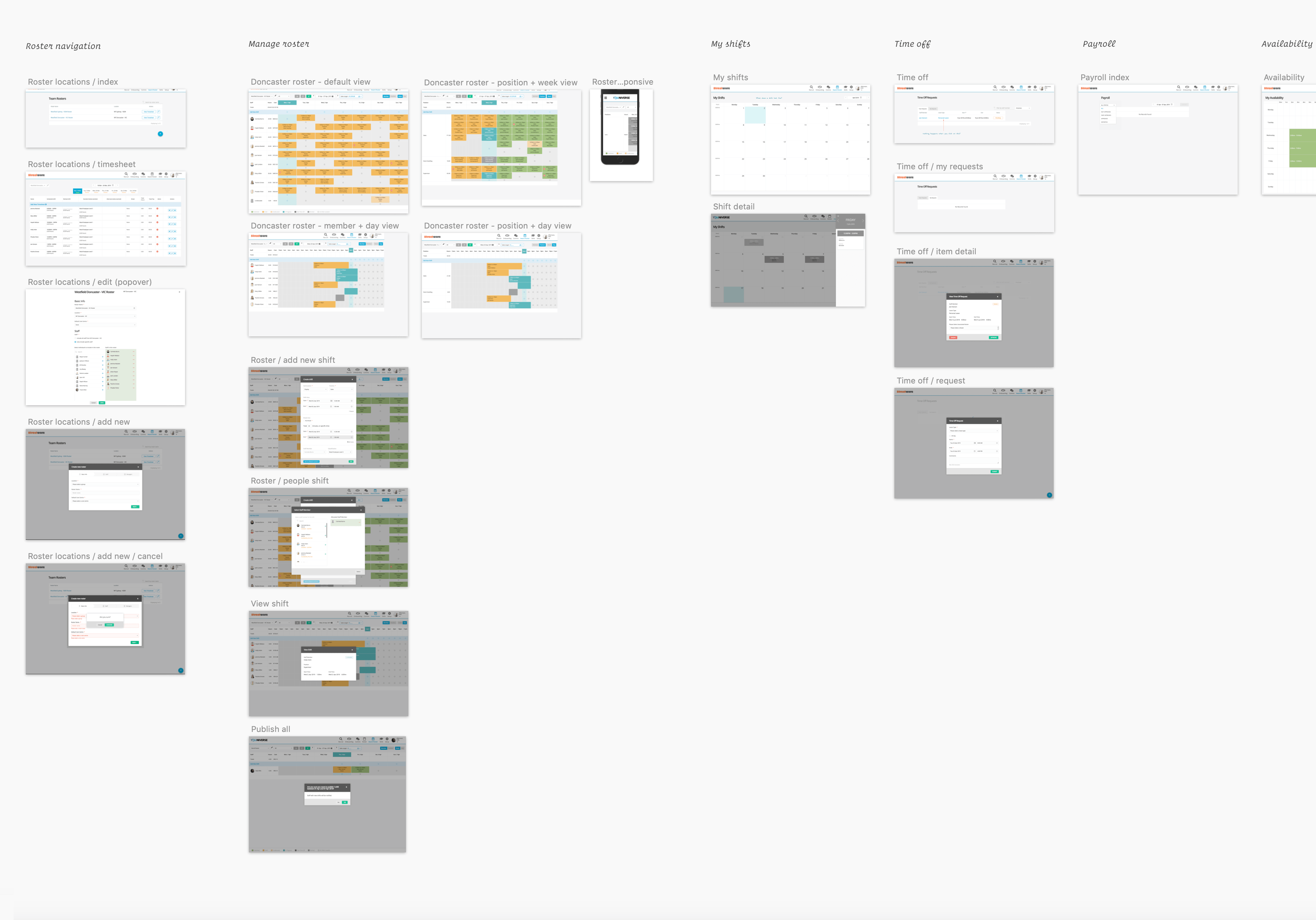
UI inventory
Next up was to curate an interface inventory of our existing product to get a handle on our existing patterns. I took screenshots of each screen in the existing product divided up by module (eg. a page for roster screens, a page for recruitment, etc) and then divided these up into another file of component pages (eg. all buttons and links, all tables, all form elements, all types of cards).
I’d have loved to have done this exercise as a group workshop, which I think would be especially valuable for establishing shared taxonomies / component naming, however the rest of the team were a little buried in other projects as this was coming together. So I built and shared foundations that the team could review and feedback on as their time permitted.
Benefits
- This UI inventory exercise revealed where there were repeated elements with different styling that could be consolidated into a more consistent style, and also helped clarify where variations were important.
- Having a birds eye view of the app’s features also ensured understanding of relationships, detail and context, which meant that useful feature details would not be lost when focusing on the detail of redesigning components.
- It also provided perspective on the most frequently used components across the app, and which ones were the most out of date, which helped prioritise design energy moving forward.
Tools
Sketch
I created the screenshot inventory in Sketch so that it could be published to Sketch Cloud to share with the team for review and discussion, and they could comment on the screens.
Airtable
I also developed and maintained an Information Architecture database in Airtable, where I endeavoured to link together app screens, key component patterns and templates with feedback gathered from user research. This was to help quantify, justify and prioritise work to be done.
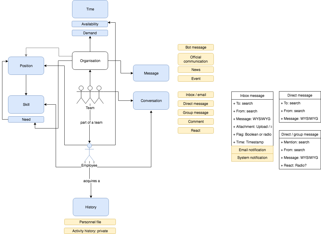
Draw.io
I used this to map out an object model for our product (or a YOUniversal schema if you will) across our product. This was to help visualise the micro patterns in the context of the macro patterns and identify where the most generic, re-usable elements are.
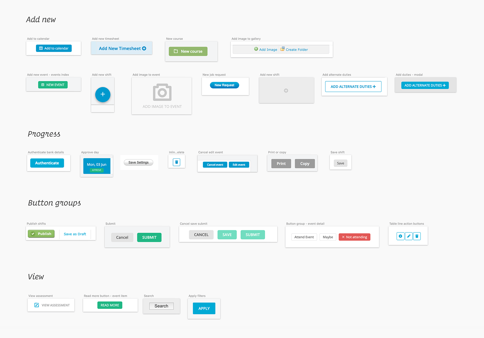
Design libraries / UI kit
Next I created design libraries for Sketch, XD and Illustrator/Photoshop, including component symbols, text styles, colour and gradient palettes.

The Sketch design libraries were the primary place where ideas for re-usable components were illustrated, tested and harmonised. They included diagrams of component anatomy, as well as illustrated notes on states and variations and basic interaction prototyping (the latter in InVision, but sometimes XD).
They also functioned as UI kits—a repository of symbols for re-use across all design mock-ups and prototypes.
Handling re-branding
YOUniverse underwent some concept rebranding about halfway during my time there. I worked with our Sales, Marketing and Product teams to align our visual branding with the updated concepts.
Design guidelines
I worked with the Marketing Coordinator and Sales team to develop some visual brand guidelines, as well as design principles to help align our vision, brand and the behaviour of our product.
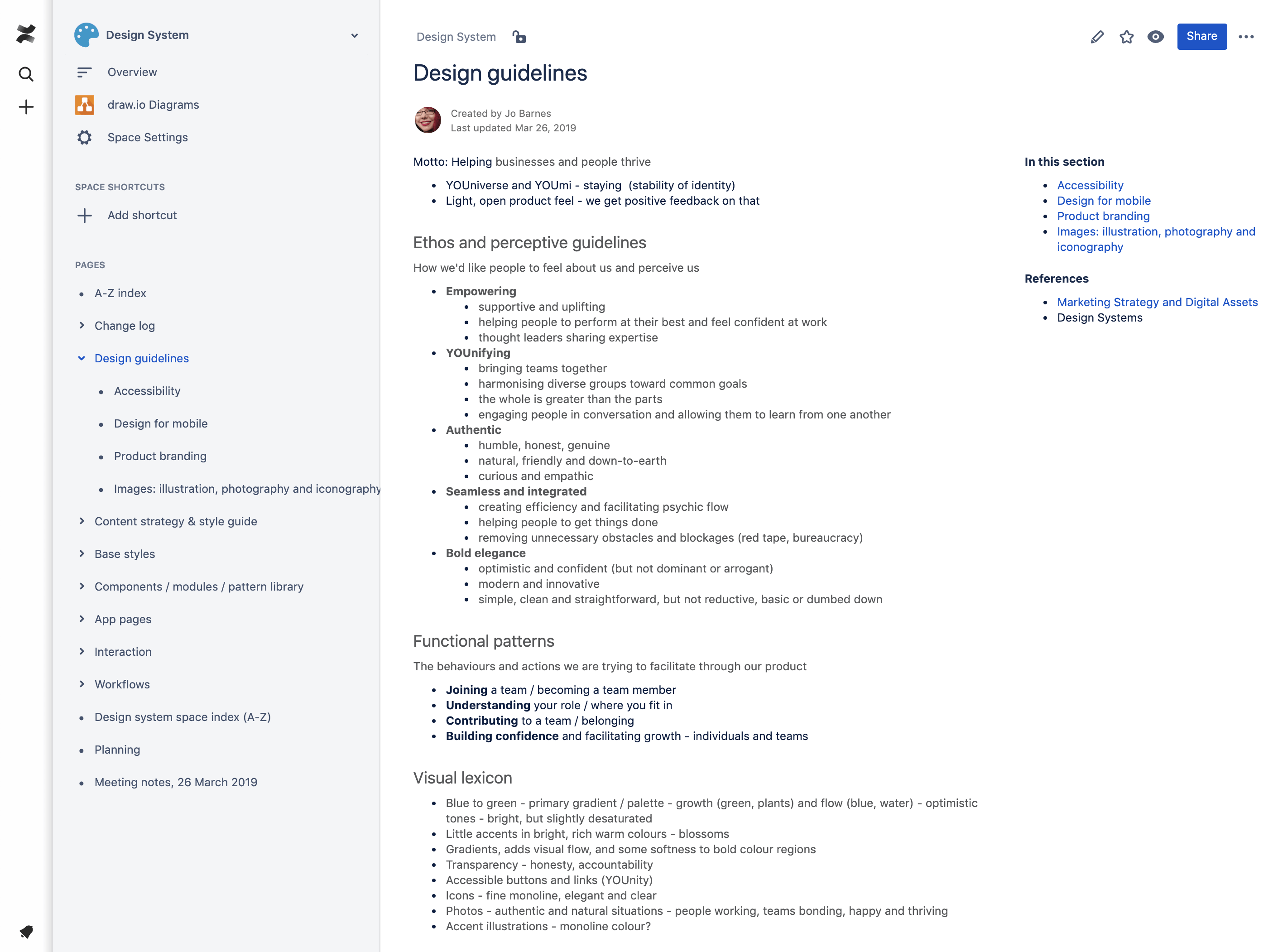
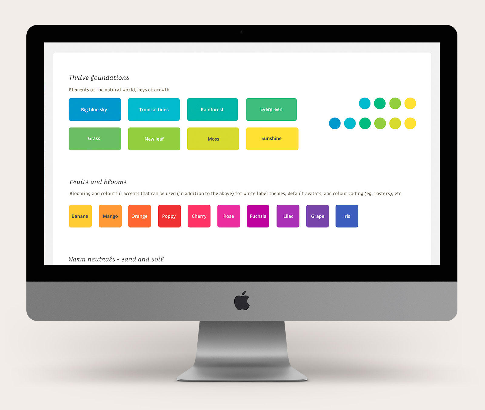
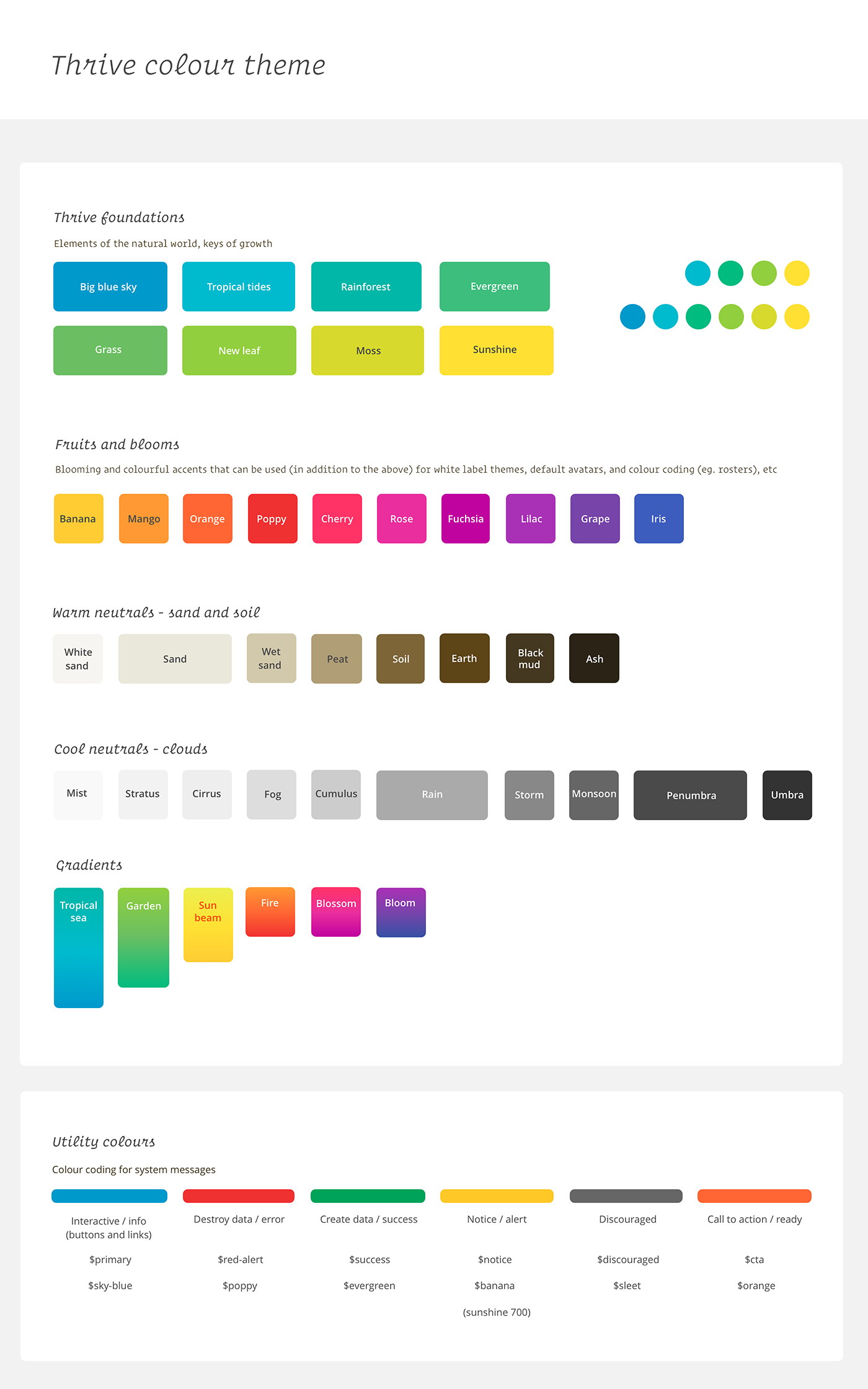
Colours
Colours were extensively documented to allow for as consistent application as possible. At the same time, I wanted to allow flexibility for both white labelling (allowing clients to apply their custom branding to our system) and colour-coding within different modules (eg. teams or locations in the roster, or different content types within in our mobile news feed).
I updated all of our foundation colours to fit with our refined direction, whilst also harmonising with the older branding and product design. I was conscious of the expanse of the product and how long it would likely take for an updated look and feel to be reflected across all of the modules, so I still wanted it to feel as united and consistent as possible as it evolved.
Our established branding was built upon space metaphors (the universe in YOUniverse), and the evolved one was all about helping organisations and people to thrive. I looked for commonalities in the concepts, so for example, I kept our brand blue and incorporated many of the existing colours into the new scheme.
I based the new colour scheme on metaphors of growth, and focused on maintaining the look and feel that our users have responded positively to in the past - the clean and light interface, with bold accents of vivid, optimistic colours. These accent colours were optimised to feature good contrast in both light (default) and dark (optional) themes.
I outlined seperate palettes and usage guidelines for marketing and product, so that they were aligned but also fit for purpose (eg. a focused set for marketing, and a more expansive and flexible set for product, to allow for white labelling and custom colour coding).
Colour scales
After selecting the YOUniverse spectrum/s, I put the foundation colours into Material Design’s colour picker to come up with balanced gradients (I tried to pick them using maths on the HEX codes first, but I found it was not as easy to create a harmonious looking system as I’d hoped - Material Design’s picker seemed to do a better job.
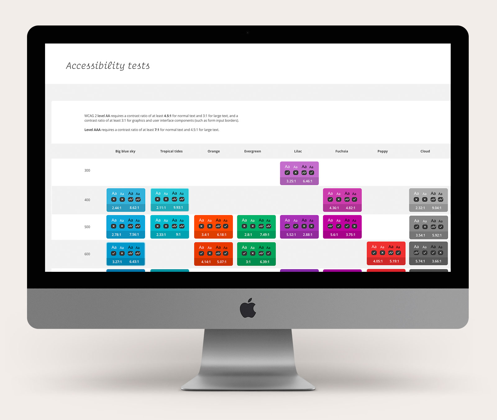
Accessibility
I also completed accessibility testing for all colours likely to be used with text to inform fast decision making.
Maximising contrast for messages, whilst allowing for flexibility in visual hierarchy (prioritising the most important information, for easy scanning, receding some of the less important information) and branding.
Typography
Also introduced a new display font to be used alongside our traditional use of Open Sans for body text, particularly for sales and marketing materials. I selected Roboto Slab, as it had good contrast with Open Sans, whilst still maintaining a feeling of openess, clarity and 'bold elegance'. It aligned metaphorically as well—the serifs representing buds of growth! 🌱
Both font licenses were cost effective (free) and in some circumstances they would be more performance efficient, with Google fonts more likely to be cached in people's browsers.
Icons
We started to use more icons to provide some visual support for our marketing messages. I selected light, monoline icons to align with the feel of our typography and other visual assets. We used FontAwesome alongside Icons8, both sets with an extensive library of symbol options, that were customisable and flexible for quick implementation on our new website, but also would be an appropriate foundation upon which to build our own adapted and custom icons later when there was more time for refinement.
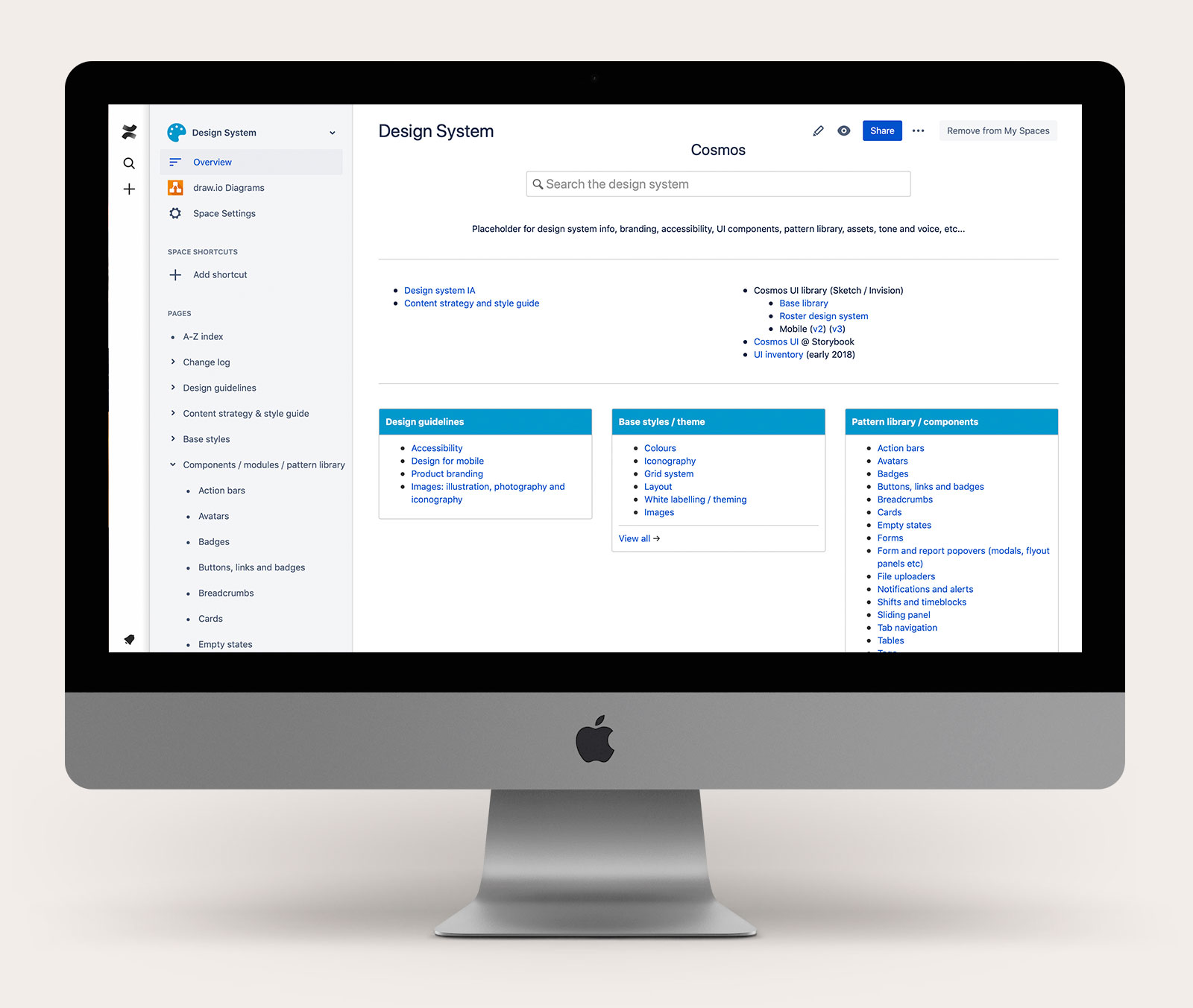
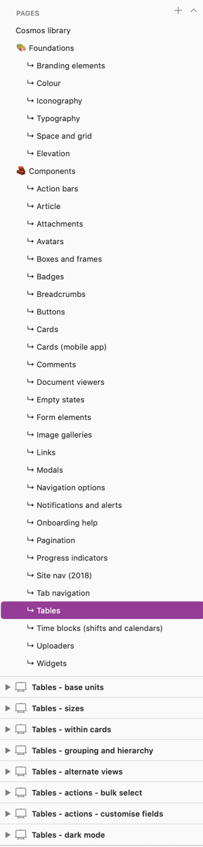
Confluence documentation
This was the authoritative source on Cosmos to bring together documentation on all of the elements of the design system, including:
- Branding guidelines and assets
- Content guidelines, IA and workflows
- Base styles and guidelines (eg. colours, gradients, text styles)
- Pattern / component library
- Design assets, prototypes, libraries
- Usage guidelines / playbooks
- Accessibility guidelines and testing results
- Related contextual and user research
I chose Confluence as I wanted the design system documentation and development to be as transparent as possible, as well as very easy to maintain and contribute to. Everyone in the team was already familiar with Confluence and was given access to review, comment and edit, so we could all be on the same page and synthesise all related strategy around marketing and branding, product design and development—everything that contributes to the overall product and service experience.
All team members could also easily follow updates in the Confluence activity log (as well more a more documented Design System change log).
I could also easily link in related Jira tickets and embed other related assets such as InVision screens, workflows in Draw.io, Airtable database views, etc…
(The downside is that I didn’t have access to the Confluence CSS to pretty the default Confluence UI up a bit and make the Design System space as fluid to read and navigate as I would have liked).
Communication
I created and maintained a changelog index in Confluence, so that it was clear what parts had been updated and when.
I also regularly linked the work in progress back into Slack channels and raised in team meetings in order to get feedback from the Product team and the broader teams. I collaborated with the Product Owner to prioritise components and styles to inform upcoming work.
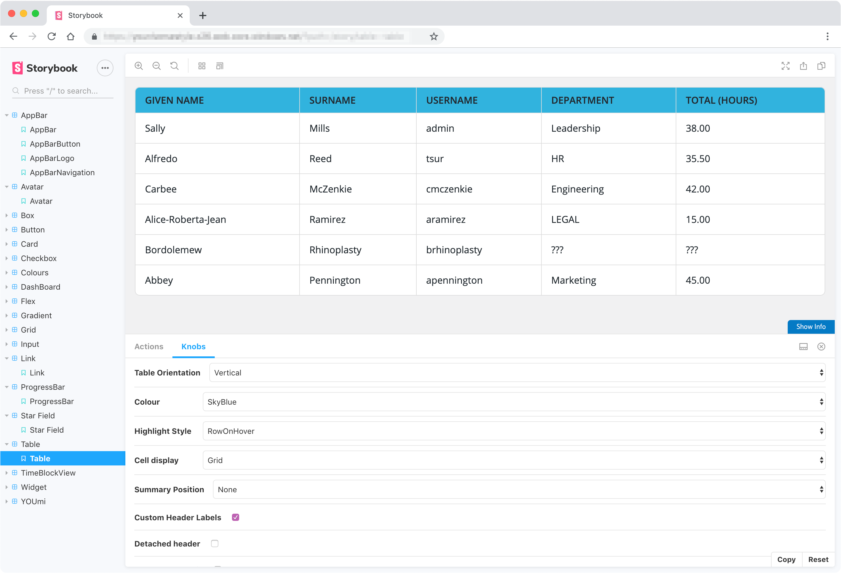
Design support for code library
I collaborated with the development team to support building a front-end code pattern library (for React) in Storybook. This was informed by the design libraries and prototypes. My role here involved testing, providing feedback, refining the designs further when needed, and linking the discrete components from Storybook back into the Confluence design system.
Next steps
Unfortunately, I had to move on before Cosmos was in a refined and robust state. As it was set-up to be a living system, a solid foundation was established for any future work. With the documentation in Confluence, I trust it will be easy to pick-up and maintain by anyone who may need to do so in future should the product be re-born.
For my part, I certainly learnt a lot along the way:
- I improved in more efficient use of tools
- Learning better ways of presenting and managing documentation
- Building workflows for managing experiments and variations for testing and when to pull out components for refinement (which can get a bit messy in when you are in the flow).
I hope to work on more design systems in the future, as I love to:
- design with patterns, rhythms, layers and scale
- work on both detail and the whole system, and working towards creating flowing empowering systems that are more than the sum of their parts
- documenting and sharing knowledge, empowering others with the information they need to get their work done efficiently and also make their contributions towards improving and refining the system/s
- ensure anything I design is as maintainable and fit-for-purpose as possible.