YOUniverse mobile app
UX research and design for the YOUniverse mobile app
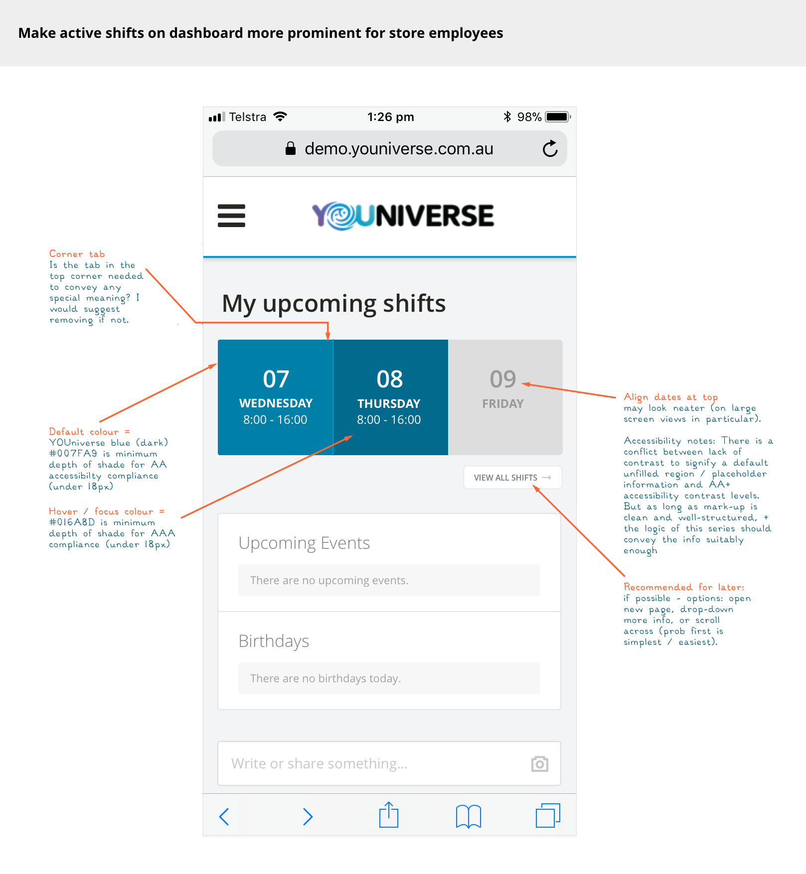
The problem
The young and casual workforces using YOUniverse’s tools are highly mobile-based, very often without consistent access to laptop or desktop computers (certainly not at work), so it was very important for us to provide tools optimised for mobile access to make it easier for them to access and engage with our platform.
The vision
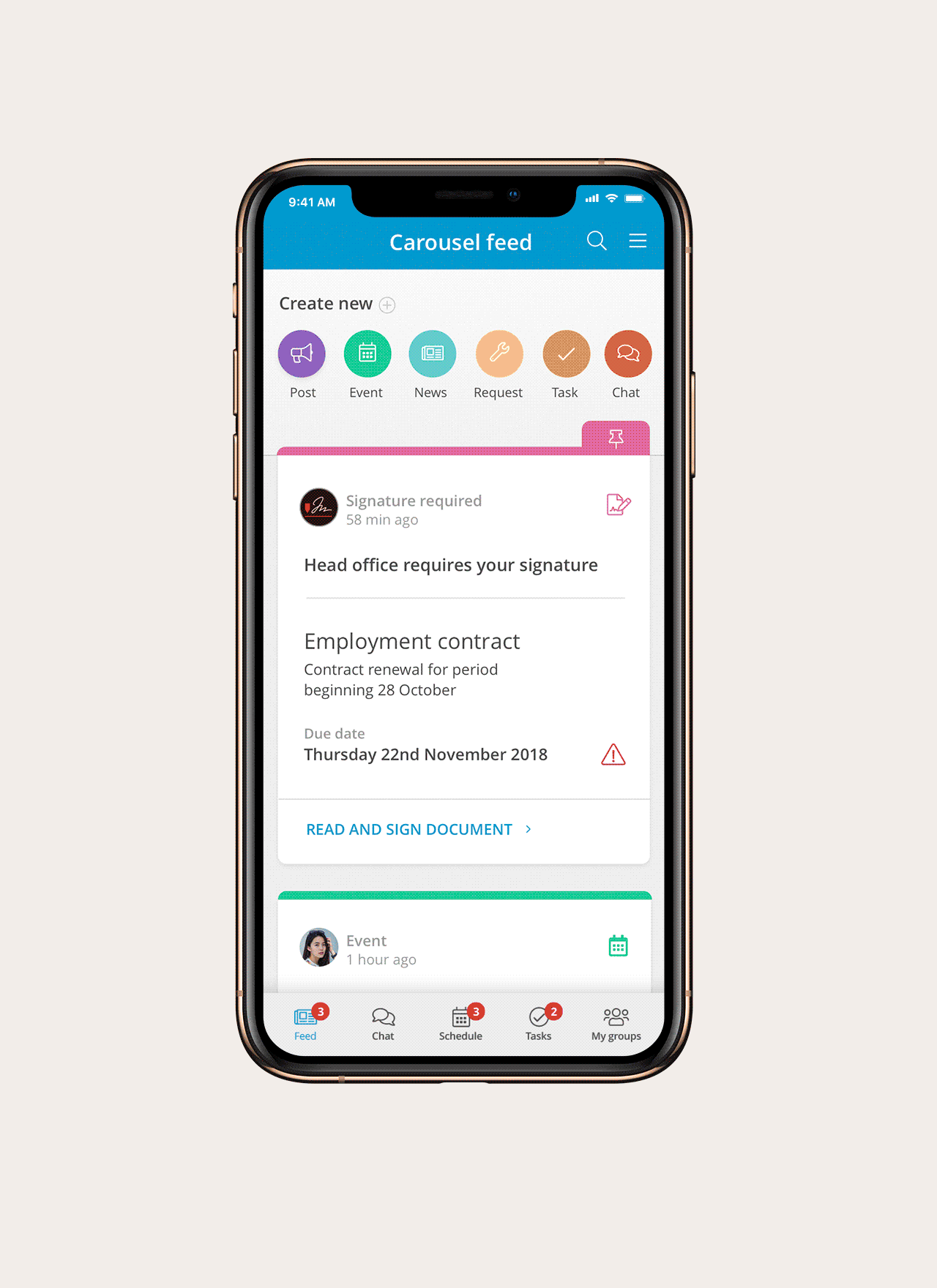
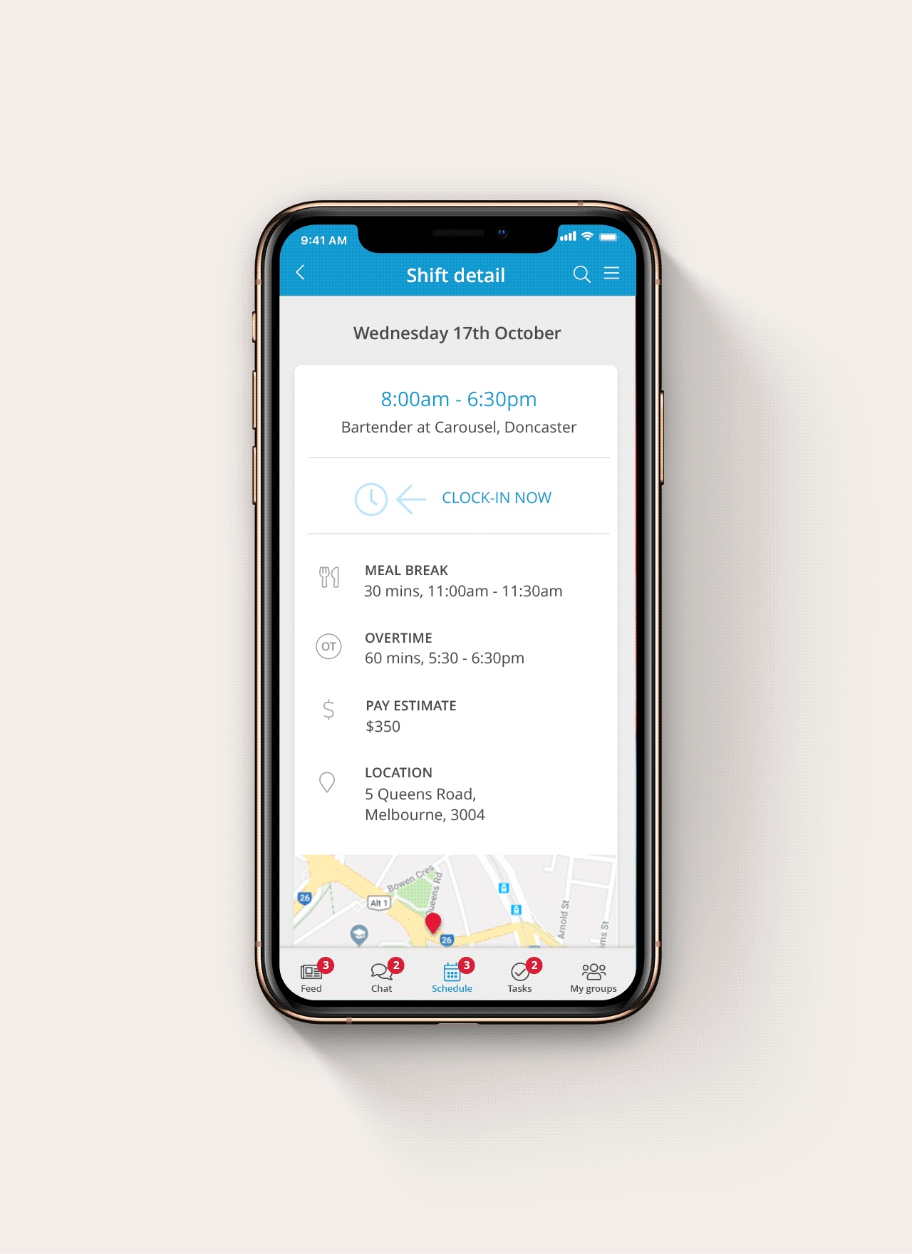
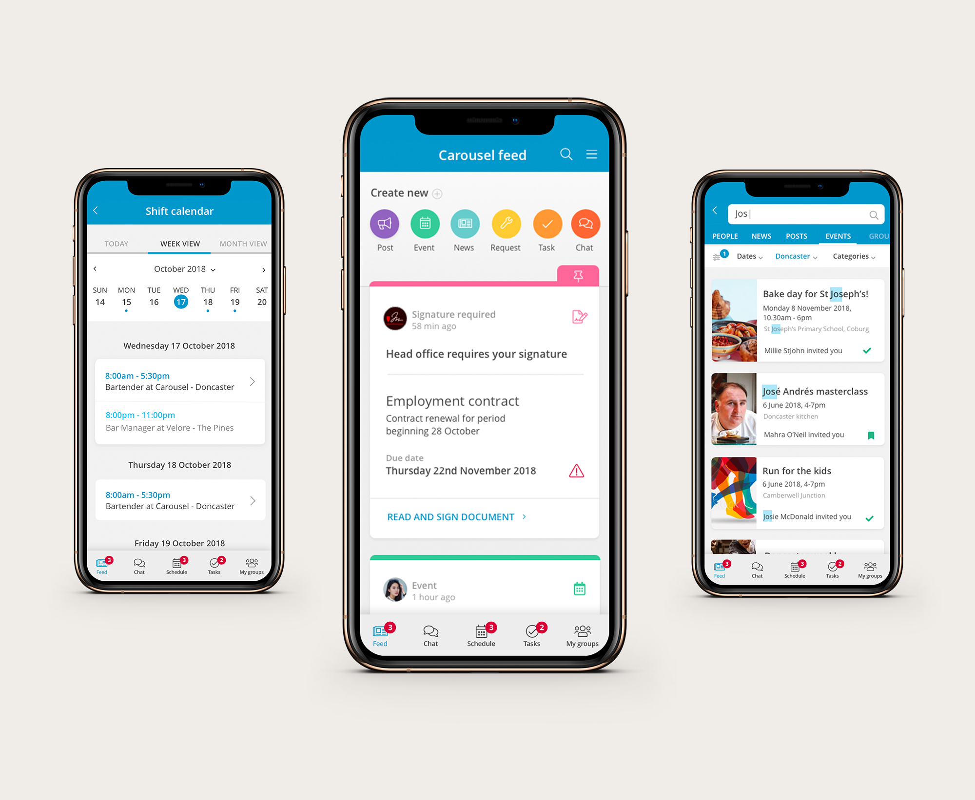
Scheduling and communications
The first iteration of our app was focused on meeting the needs of employees recieving their roster information and facilitating team communications.
Feature parity with web app
Our first goal was to deliver a cohesive mobile app providing key feature parity with the roster and comms tools in our web app in the short-term, so that it could be used in a cohesive and intuitive way across platforms.
Looking to the future
I also considered the ways the web and mobile apps might be developed and integrated into the future (taking a holistic view), and aimed to design in a flexible way that would accommodate iterative changes and graceful scaling.
Role & team context
My role
My role as User Experience Designer for this project included:
- Design research (stakeholder, user and industry research)
- Content strategy including IA
- Design, layouts and art direction in Sketch
- Prototypes and specifications using InVision
- Developing and maintaining design systems, pattern and asset libraries for mobile
- Liaising on design with product and development teams
- User testing throughout to validate product ideas and test features
- QA testing and continuous improvement
The team
I worked closely with a team that included:
- An inhouse product team
- An inhouse development team
- A team of both local and international developers
Read more about my process for the YOUniverse mobile app design
Research & discovery
One of our primary goals was to considate the varied messaging features in our primary web app into a simple mobile messaging experience that was easy and fast to access from anywhere.
-
Contextual research & stakeholder interviews
I first spoke to stakeholders, reviewed our company literature and past customer feedback research to get an overview of the landscape and initial expectations for a mobile app.
-
Discovery workshops with product team
I participated in planning and storymapping sessions with the product team to develop our common understanding of the business goals, user needs and technical feasability for a mobile app and decide on the best ways to move towards delivering a minimal viable app.
-
In-app feedback surveys
Once we prioritised communications and rostering features as the focus for first app, I launched some customer surveys focused on these features to gather information about user satisfaction, requirements and gather interested contacts for further research interviews. I used Survey Monkey for a detailed survey, and Hotjar for more quick and focused spot surveys.
-
Established foundations for benchmarking
I also set-up and monitored analytics on our web app including Google Analytics and Hotjar heatmaps. I also set-up a generic incoming feedback survey in Hotjar which was a quick survey with sentiment analysis (allowing our users to quickly provide an emoji response about their experience with the product on a scale of love to frustrated), along with a product screenshot and optional comments about what they were responding to.
-
Customer interviews
I spoke to a variety of current customers about their needs and expectations for a mobile app. This included both employees, line managers, area managers and HR representatives. I summarised this and presented it back to our team for further discussion on problem definition.
-
Content inventory
I completed a UI inventory and looked at analytics and user feedback on all of our messaging features to understand where there might be opportunities for feature consolidation or refinement eg. asking the question was it neccesary to have both an inbox and a chat feature in our mobile app?
-
Mapping activities
I also mapped user journeys and key task workflows to understand how users moved through the site to achieve common tasks and any obstacles that currently existed to efficiently completing these tasks.
-
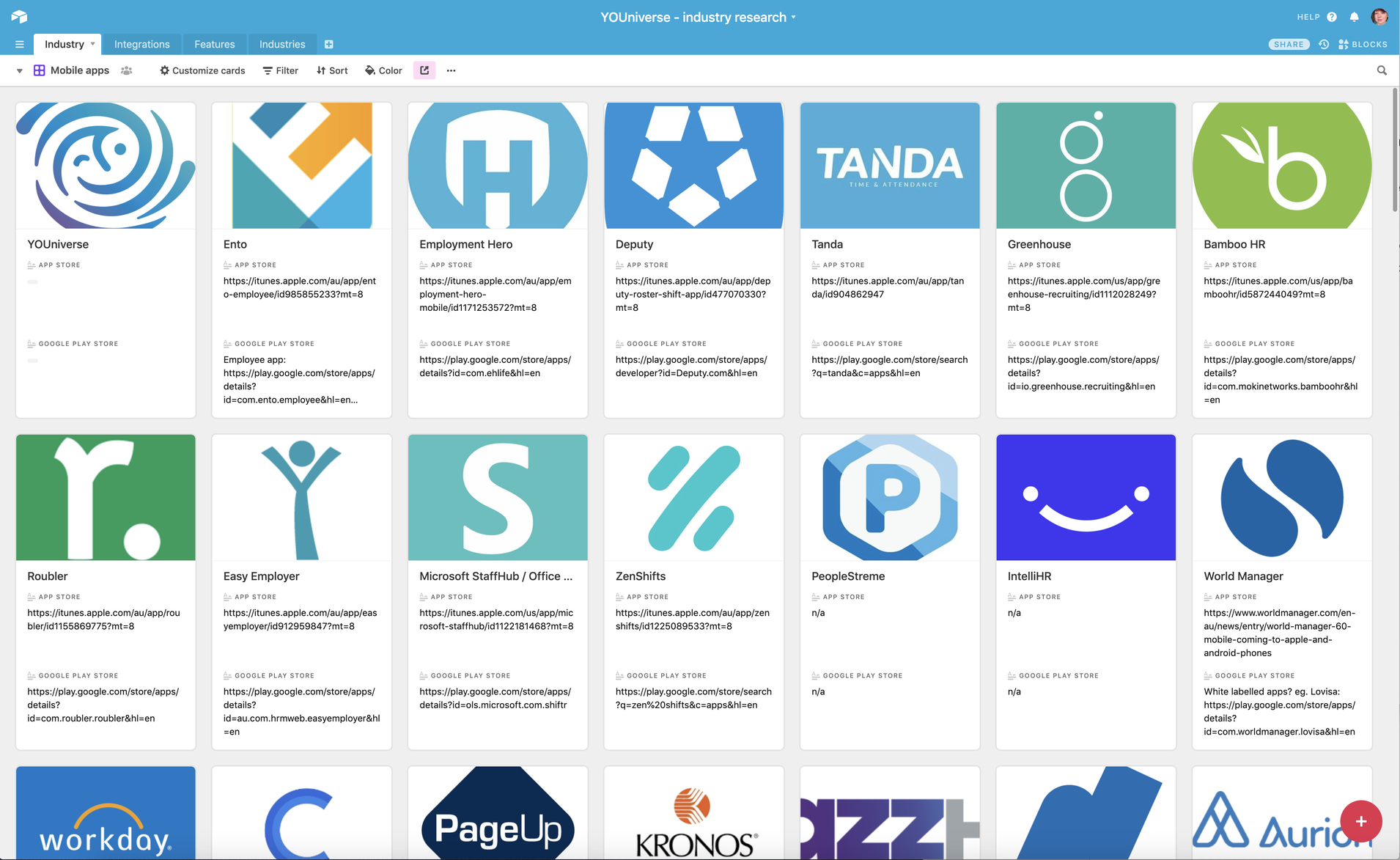
Industry & competitor research
I reviewed our competitor's and related apps (eg. other team communications tools and rostering apps) to get a sense of the industry standards and best practices. I did a site comparison matrix, SWOT analysis, and some loose content mapping in Sketch, to get a good sense of strengths and weaknesses.
-
Literature review
I also reviewed articles and books on current industry best practices in the mobile landscape.

Design
One of our primary goals was to considate the varied messaging features in our primary web app into a simple mobile messaging experience that was easy and fast to access from anywhere.
Mobile optimisation for responsive web app
Refining some of the key features for employees to ensure they were mobile-optimised in the short-term. Exploring what the limitations of a responsive only mobile implementation were
'Straw man' concepts
Once it was identified that a mobile app of some sort was necessary for ease-of-access and notifications, the first step I took in terms of designing was to explore some options and start to loosely sketch out workflows and screen concepts. This served the following purposes:
- help me explore and understand how we might start to integrate our varied messaging and scheduling tools into a cohesive app,
- have some visualised concepts to bat around to help us get feedback from customers and prioritise features,
- provide some visuals to help the executive team further understand the potential value and viability of a mobile app in order to prioritise further investment in mobile development,
- something to demonstrate and explore with sales prospects to illustrate our future direction and their interest,
- It was also the foundation for the first technical prototype that the developers produced in a hackathon day.

'Mobile app blitz' / hackathon
As everyone was working on multiple projects at once, the team held a hackathon day to speedily gather learnings, shared understanding and produce a prototype that could be demonstrated to customers and prospects.
My role here involved:
- Before the day: prepare a mock-up / prototype in Sketch / InVision that the team could work from
- On the day: working with the developers to answer questions about the designs and extending / adapting the designs and workflows to the concrete feedback and discoveries of the moment (eg. what was found to be technically viable and what was viable to deliver on the day)
- After: using the prototype to gather some feedback from existing customers and further adapting designs

User testing & validation
Over the life of the project I undertook four rounds of testing, interleaved with regular stakeholder consultation and design refinements
Round 1: Existing customers
Firstly, both myself and other team members demonstrated some mock-ups and prototypes to our existing customers (mostly from the buyer / implementor level of our target audience), to ensure it was addressing their needs and to gather any ideas / requirements for improvement.
Feedback was very positive and enthusiastic at this stage, and the main feedback was just to deliver it as soon as possible!
Round 2: Remote market research
Next I organised some remote research to be conducted via Alpha HQ. Members of our target audience group completed a short survey and then navigated through our InVision prototype to complete key tasks whilst narrating their experience. From this, we recieved video recordings and summary reports, which were shared with the team. This informed some of our feature prioritisations and design iterations as we progressed.
Round 3: Employee interviews
Next-up, I conducted a round of one-on-one, in-person interviews and task tests with members of our employee persona group, recruited via Askable.
Feedback was generally very positive about the prototype UI, and task tests were mostly successful and efficient - I used a lot of patterns that this group was comfortable with and appreciated. However, with some of the less established patterns, I learnt about some areas that could use improvement to be more robust.
Through these interviews we also recieved reinforcing data about some of the cultural factors that would likely affect engagement with our app by this group, which generated ideas about how we could support our customers' implementation teams to build business rules and cultural practices that would help them get the most out of our product.
It was reinforced that for employees to feel comfortable using an employer-sponsored app for team communication, their employers would need to provide mentorship, and build clear cultural expectations, so that they would feel comfortable using it.
Round 4: Roster manager interviews
Finally, I undertook some more mobile testing as a part of a broader initiative for testing our new roster features with roster managers. This also involved an in-person interview and some limited task testing.
These interviews also formed a foundation for future mobile developments specifically focused on addresing the needs of roster managers.
Research output
Outcomes of each stage of the research was published on our wiki (and socialised via Slack) -- including summaries, images, reports and recordings -- so that all team members could benefit from learning from our users and understanding more about their needs. They were also summarised and discussed in planning meetings. Where time permitted, I also extracted key information into an Airtable database, adding requirements and quotes against the relevant parts of our information architecture, so that needs could be a bit more quantified and more easily prioritised.
Design refinements & build support
Stage 1: Alpha launch
The first version of our app was developed with a remote development team as well as a local product team. My role involved:
- participating in sprint planning and strategy sessions with local and remote teams
- refining relevant concepts ahead of sprint goals
- functional and aesthetic testing
- providing feedback to developers via Jira and Slack, using diagrams and screencasts (also tracking in Airtable)
Stage 2: Beta launch
I supported the beta launch by working alongside our local development team to refine and adapt the designs into minimal viable product based on issues as they were discovered (eg. technical, time constraints). I also built out our design system, provided regular functional testing and feedback, and helped to prioritise features based on data from previous testing, standards, heuristic evaluation and industry benchmarking.